Website UX · Information Architecture · Visual Storytelling
Connecting heritage, product discovery, and a changing industry.
A responsive corporate website experience for Gallois Sisal, a Madagascar-based sisal producer. The design connects the company’s history, fiber grades, sustainability initiatives, news, and career opportunities through clearer information architecture and storytelling.
- Company
- Établissements Gallois Sisal (EGS)
- Credit
- Gallois Sisal · With Riake Agency
- Location
- Amboasary-Atsimo, Madagascar
- Sector
- Sisal fiber production
- Format
- Responsive corporate website
- Scope
- Website UX · Information architecture · Visual storytelling
- Status
- Overview · approved mockups shown
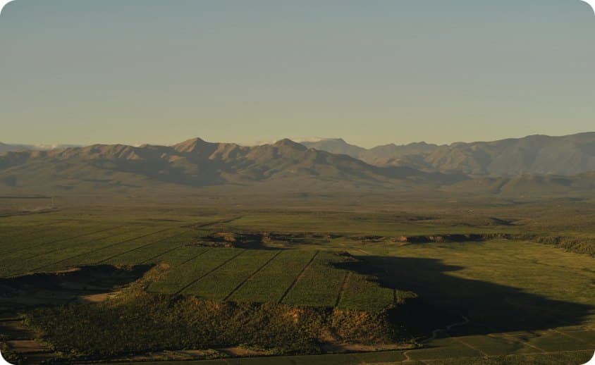
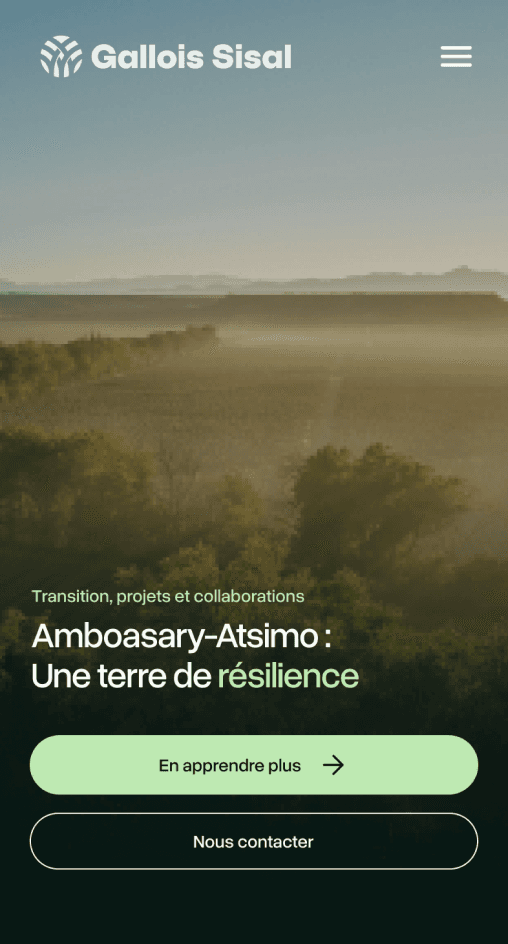
Project overview · approved screens from the design file · With Riake Agency
01 / What the website brings together
One institutional site, several kinds of content.
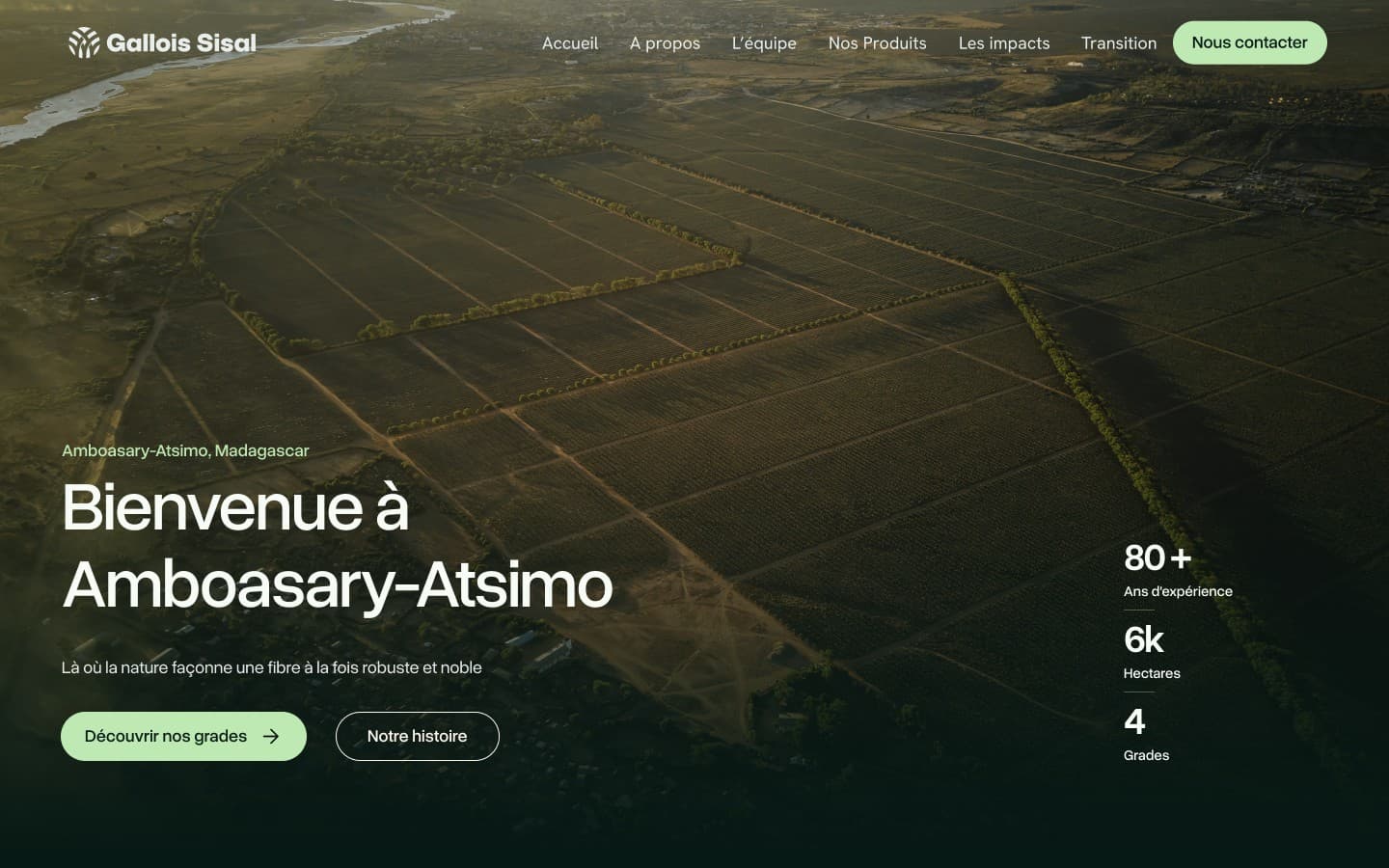
The experience gathers content that used to sit apart, so that each visitor can find the part of the company that concerns them:
History and heritage
The company’s story and its roots in Amboasary-Atsimo.
Fiber grades
The sisal fiber products and the differences between grades.
Transition initiatives
The sustainability and transition initiatives the company is engaged in.
News and careers
Company news and career opportunities.
02 / The UX angle
An editorial site that organizes several journeys.
An editorial, institutional site that holds several journeys together: understand the company, discover the grades, explore the transition, get in touch; a clearer structure and visual storytelling connect them instead of stacking pages.
Understand the company
Who Gallois Sisal is, where it operates and what it stands for.
Discover the grades
Find the right fiber products and understand what distinguishes them.
Explore the transition
Follow the initiatives that accompany a changing industry.
Get in touch
Reach the company for products, partnerships or careers.
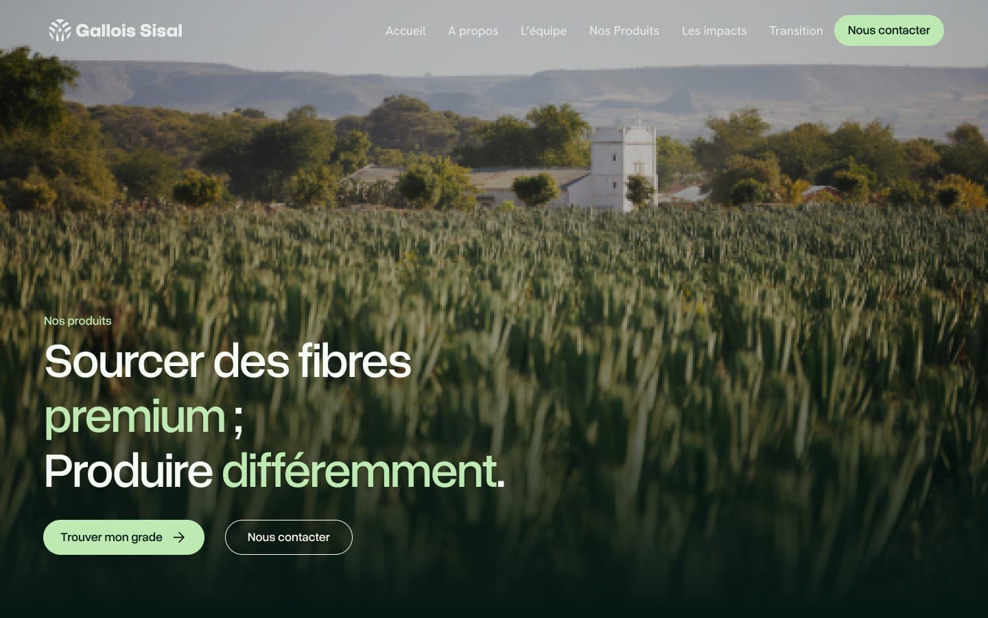
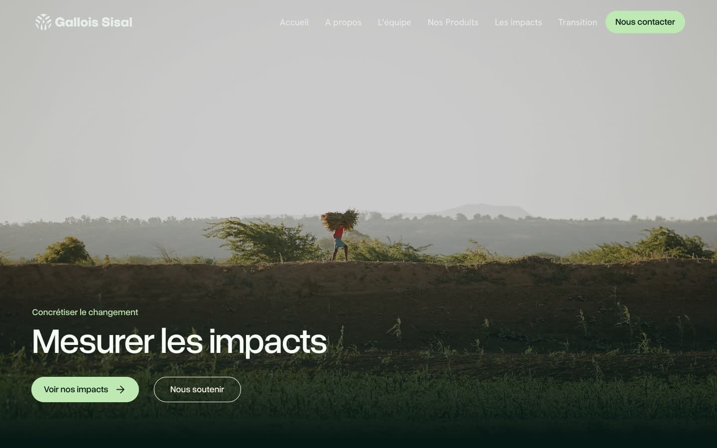
Gallois Sisal · corporate website
Seven pages, one section grammar
About and team
- The story since 1945
- The team
Products
- The fiber grades
- Entry to the grade finder
Impacts
- Measured impacts
- Ways to support
Transition
- Transition initiatives
- Territory
Contact, news and careers
- Contact and FAQ
- News
- Open positions
One grammar for seven pages
- Problem
- Seven pages with different content, read by the same visitors on four widths.
- UX principle
- Consistency and standards (opens in a new tab) · Nielsen Norman GroupThe approved structure illustrates this principle: same hero, story blocks and actions on every page, so one page teaches how to read the next.
- Design decision
- One section grammar across pages and breakpoints; each page keeps its photograph, title and pair of actions.
- Visual evidence
- Home, products and impacts heroes above · section 03.
- Outcome · status
- Approved mockups · split of the work with the agency not published.
Approved responsive mockups of the website, designed with Riake Agency; the detailed split of the work between the agency and me is not published.
03 / Responsive and explorations
The same grammar from 1440 to 393.
The story block and the mobile hero show the sections at both ends: the photograph keeps its place, the text column narrows, the actions stack.
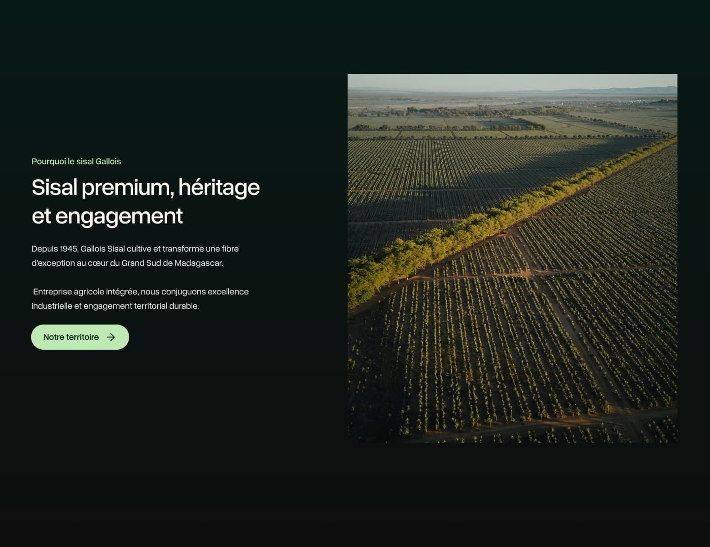
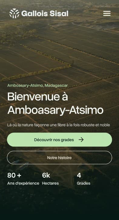
The file also explores a short questionnaire that orients visitors to the right grade, reached from “Trouver mon grade”: a candidate for a future case study.
Interface explorations from the design file — not presented as developed or deployed features.
04 / In sequence
Three pages, one grammar, in motion.
The home, products and impacts pages played one after the other: the photograph, the title and the pair of actions keep their place from one page to the next. Three approved mockups shown above, no product interaction: the transitions are presentation only.
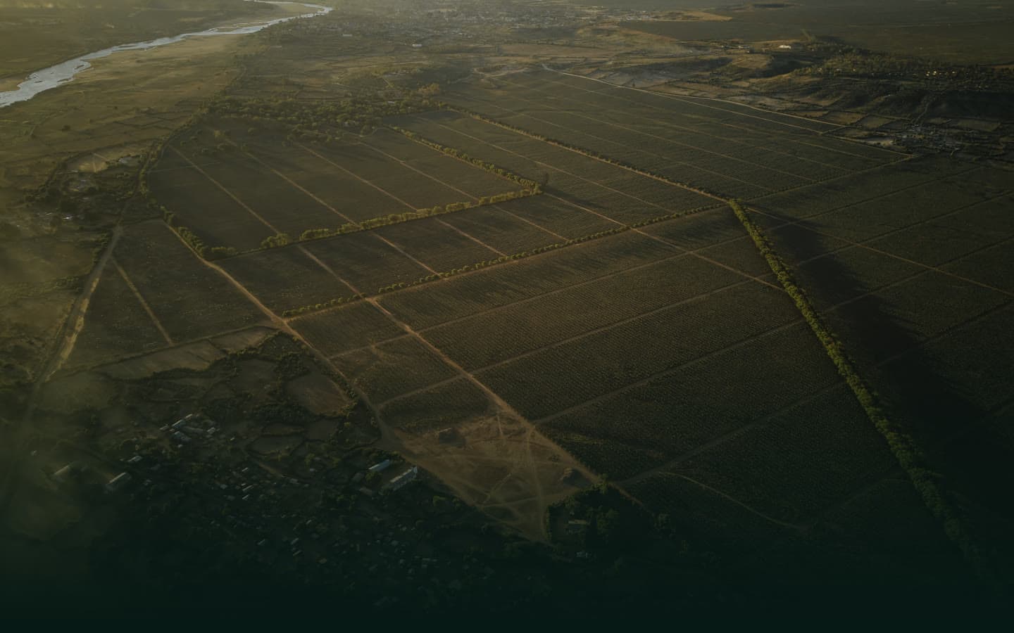






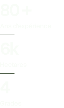
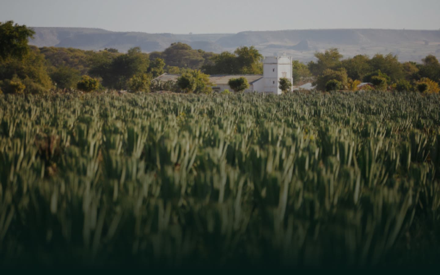




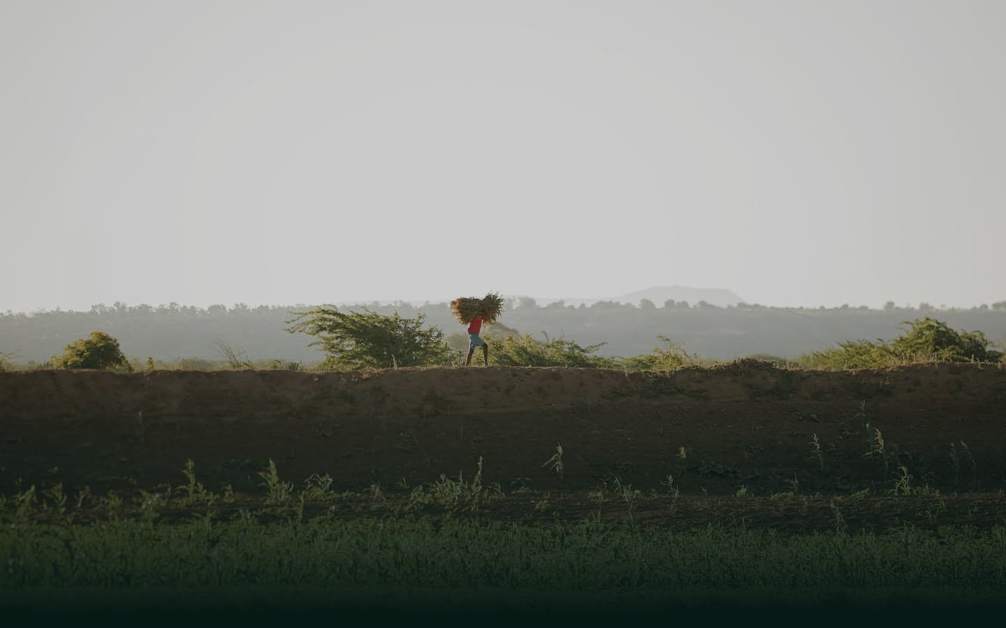




Scene 1 of 3 · Home · the territory firstAerial photograph of the fields, two entries, grades and story, the company’s figures.
Sequence built from the approved mockups of this page; nothing is recorded from a live site, no feature is shown as developed.
05 / Status
What this page is, and what comes next.
A project overview: approved screens and verified facts only. The detailed contribution, decisions and trade-offs will be published once confirmed; no result or metric is claimed.